
Information is Beautiful – G Research Lecture Series Review

David McCandeless is a titan in data visualisation – no doubt about it. And with The Science Museum’s immersive IMAX screen, we saw the vastness of a billion dollars, examined the medical veracity of “superfoods” and proved the most controversial question of all – what is the best dog breed? (All backed with data!)

With beautiful colours, composition and storytelling, McCandeless’ approach to data visualisation invites all audiences to engage with the world around us. Like a bakery window with glossy cakes, he draws users in with data, design and a story.

But how does this message fare in a room full of quants? He demonsrates data visualization’s power to engage with his final audience game, asking a series of questions of what is more popular on Google: Beer vs Wine, Cornflakes vs Toast, Youtube vs Sex (the answer may surprise you). 400 people immediately took to the 101 of data analysis: to think, take a guess, and to revise one’s answer. By demonstrating how data visualization can bring conversation, McCandless taught an audience of all disciplines how we can be inquisitive about our data- to move from information into knowledge.

Unsurprisingly, the topic of fake news was raised during the Q&A period – how can we spot fake news? As a journalist, ad man, and designer and developer, all these talents still suggest this 1 answer: its tough to spot and trusting your source is key. Data Visualisation is powerful – use it wisely.

Here are some of my pictures from the event:

How to Find the Number of Active Projects at Any Given Point in Time

This analytics problem is a rite of passage – we all eventually get asked it. And it usually goes to a tune like this:

“I have a list of projects with start and end dates. I want to know at any given time, how many projects are active.”

(Btw the TL;DR for this is actually this great video by my TIL colleague Andre)

In this case, we looking for how many orders are being prepared for shipment at any given date?

Here’s my viz.

Using Superstore, the data you’re given looks something like this.

And visually represented, we know that these projects all overlap on March 16 2016.

But how can we express this as a line chart? i.e. not at a given point in time, but how many over time?

For such a simple question, it actually has a rather complex (but easy to implement!) solution. It requires a product join.

The difficulty with this easy to ask question is that …how can Tableau plot data for a datapoint that effectively doesn’t exist? That is, when we look at the data, March 16 only occurs 3 times.

So as smart as Tableau is, it does not know that all the orders in the list are in preparation mode, just like the other 3. (Well Tableau CAN know, but lets put densification aside for another day).

Step 1: Prepare your Data

Given this train of thought, that means we need to give each entry (order ID/employee/project/whatever your flavor of granularity) every date we want to compare against.

And since we want to be able to compare against any date, we are going to multiply each entry 365 times for 365 dates.  This will pad out the underlying dates and give the data structure we need to make this work!

That means you’ll need a dataset with dates you want to see in 1 column and a dummy variable in another. I’ve very creatively called mine “One”.

Then you’ll have to add the dummy variable to your original dataset. In this case, I added a “1” running a straight column down the Superstore data.


Set it as an inner join in Tableau

Almost there!

Step 2: Create Your Date Filter

.. then put this filter on columns.

Step 3: Start to create your view!

Put date from your dummy dataset on columns and add the count distinct of your chosen dimension on rows.

In mine, I get something like this.


Other resources I’ve used to get to this method include this great video by my colleague Andre and of course, the great Bethany Lyon’s talk on Cross Database Joins at TC16.


Happy Vizzing!~


How to Analyze Year over Year Performance at the Weekday level

When I worked in industry, everyday I reported sales performance at the day level and compare its results against the same weekday the previous year.

“If we had a bad YoY comparison, did we have a big promotion the same day last year? Or if not, which categories did better or worse?”

To add to the complexity, the business had a regular promotional week where new pricing would update every Friday. So comparing Jan 6, 2017 (a Friday with new prices and promotional tactics) against Jan 6, 2016 (a Wednesday) was not helpful!

Its an excellent way to look at the business tactically, and get some actionable insights quickly. And luckily it’s really easy to do in Tableau!

Step 1: Find the same weekday last year


Step 2: Add the same datasource again

Here, I’ve added Superstore again through the other menu since it was giving me grief through the “Saved data sources” pane. This way, I can just simply navigate to the dataset sitting under “My Tableau Repository”


Step 3: Configure the blend through the Edit Relationships

Here we specify that we want the “Day/Month/Year” of Order Date and Order Date in the Previous Year to match, as well as the product subcategory. This is how we’ll be able to see which subcategories had new or declines in sales between the years.


Step 4: Validate your data post Edit Relationships

Put [Order Date] and [Order Date LY] from the same data source (the first one we pulled in) on rows and [Sales] from the same datasource on Text.

Then put [Sales] from your secondary datasource on the marks pane to create the following table.

In the view below, I’ve already renamed it to be [Sales LY] in the secondary datasource. But remember that its only because I’ve got my edit relationships set up and I’m using this as a secondary datasource that it will render sales this way. Otherwise, it will not retrieve sales from last year,


Want to check to see if its pulling in the right value? Just scroll up [Order Date] and check if its referencing the right sales amount. Here – the $732 in sales match!


Step 5: Create your Year Over Year Calculation


Then see what it looks like against time..


I find this view (while computationally correct) too messy and variable to garner any insight.

I find it much more useful when I filter the view to the last 10 days. Even better when I conditionally color it against if its done better or worse than last year!


Step 6: Build a dual axis bar chart  with [Sales] on 1 axis and [Sales LY] on the other.


Final Thoughts

In the last view, I’ve already got it filtering by a particular day, but I can easily attribute which categories I made gains in, and which ones I wasn’t able to produce better results compared to last year. Maybe the promotional tactic wasn’t as good, maybe there were extenuating factors.  But its great to know isn’t it?


Hope this will be helpful for you!


Viz Club – BBQs and Drinking Fountains in Melbourne

Viz Club is Back!

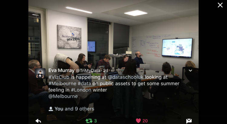
We revived Viz Club after interest on Twitter (and since Eva Murray and Carsten Weidmann were in town!). I was running late that day and unbeknownst to me, everyone else at Viz Club that day.. had no idea how it worked.

For the London group, I think I’ve figured out a formula:

1. #ThrowbackThursday on Spotify.

Something about Michael Jackson/ABBA/everything 80’s just seems to have the right head bop/shoulder shimmy for a weeknight viz session.

2. The Viz Driver

In this case it was Lorna because Pablo volunteered her first. Sneaky tricks from Coach Kriebel at play!

3. Backseat drivers

i.e. the rest of us. Sarah Bartlett, Amanda Patist, Ian Baldwin, Charlie Hutcheson, Naledi Hollbruegge, Tommy Lees, Eva Murray  and Carsten Weidmann. But to be fair, I’m 80% certain Ian was there because I highjacked his computer since it was already connected to the speaker – so he couldn’t go home.

4. Beer and pizzas.


Its a rough gig being the driver- but I think its a nice payoff, getting a free viz to post to your profile after. Check out this piece of magic!
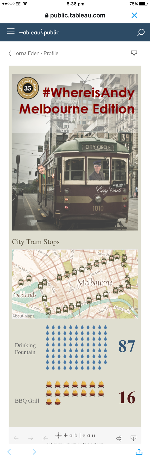
The Data

We explored Melbourne’s Public Assets – namely shape files on Melbourne’s sidewalks, water fountains, barbecues and its City Circle tram. We connected through Exasol, already preloaded by Eva and Carsten for us 😀

Looking at this data was a nice distraction from the snow warning we got on the news.  Eva kindly found the data and even pushed the shape files through Alteryx to create the .tdes!

Exploring the data

It turned out that all the datasets were maps. Which is why its not surprising one of our first views came out like this. We call him “Map Man”.


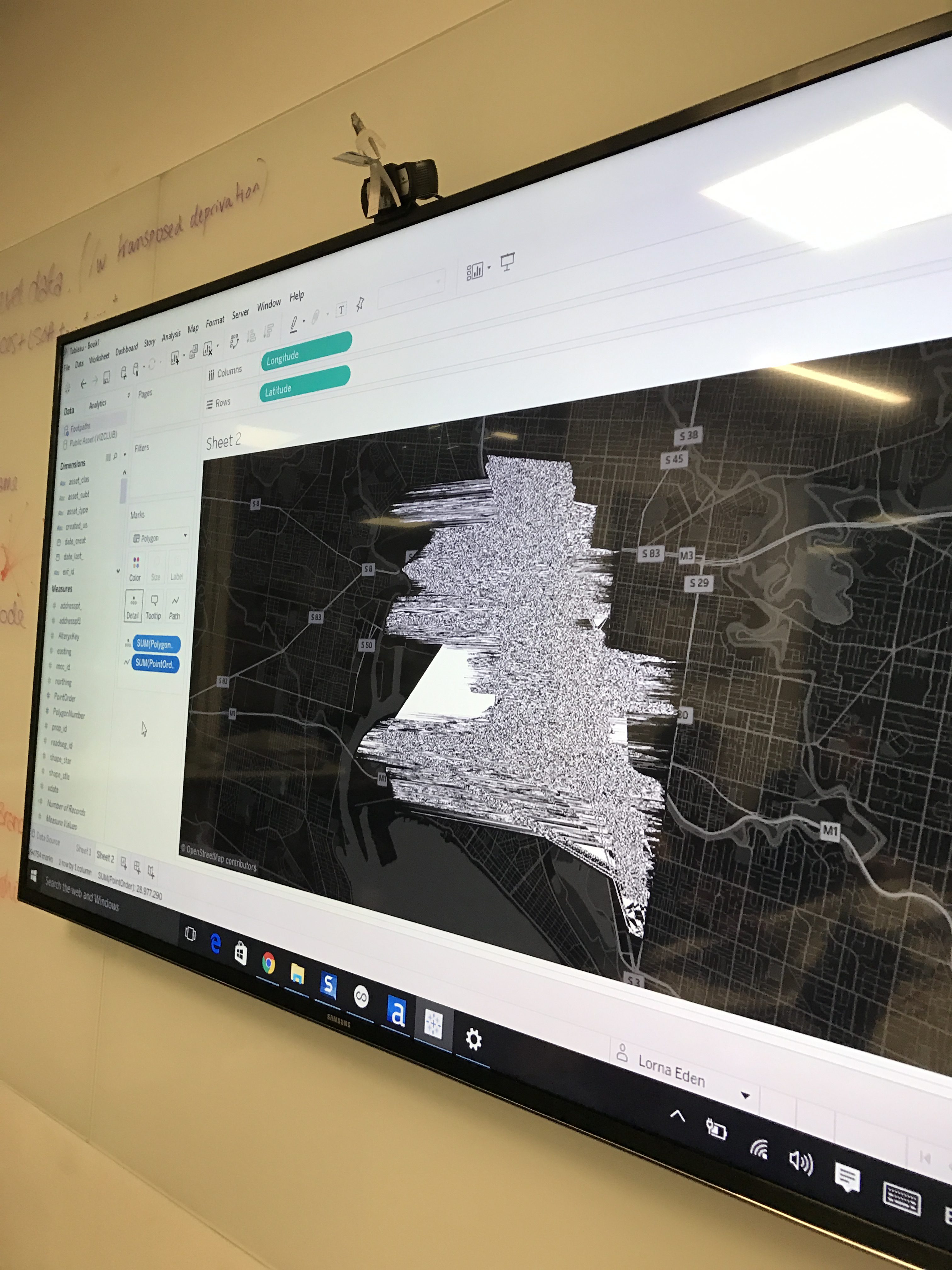
We eventually started understanding which fields go where on the canvas. Here’s us mesmerized by sidewalks dataset.

There’s something so soothing about seeing map data plotted perfectly against a background map.
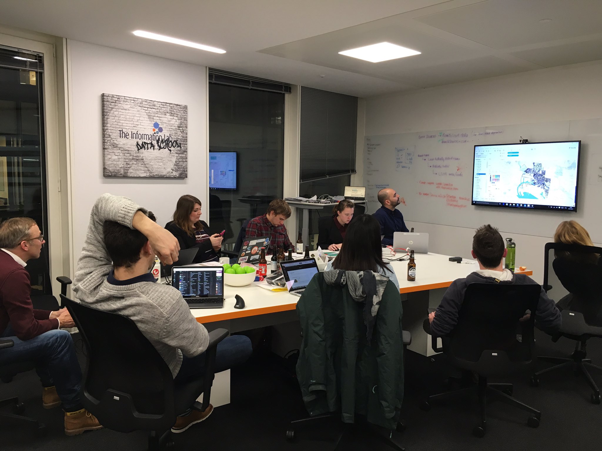


Tableau Techniques

One of the upsides of Viz Club (other than a sensible weeknight party) is learning Tableau!

Using Mapbox in Tableau

I use mapbox pretty often, but quite a few people didn’t know how exactly to hook it up to Tableau. After showing that all you needed was a free license key to plop into the maps section– voila! “Ooos” and “ahhhs” all arround. If you’re interested, the map is the free “Pirates” theme – who knew right?


Flat Icon and The Noun Project for Free Icons

If you’re in need of a free icons – look up Flat Icon and The Noun Project. Great selection and usability! Thank you Pablo and Lorna for those!


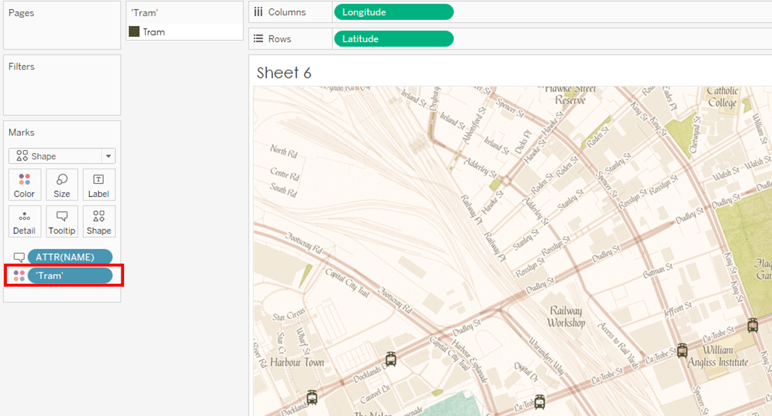
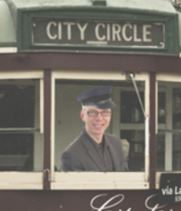
How to color an Image Shape

This tip made me go “Hold up – rewind – what did you just do??”.

If you’re using images in your shape files, you can color them by creating a new dimension (“Tram”) then putting it on color!


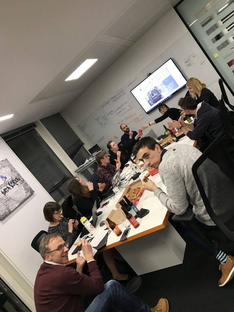
All this Tableau-ing is hard work! Time to refuel!


Finally Dashboarding!

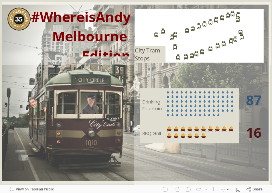
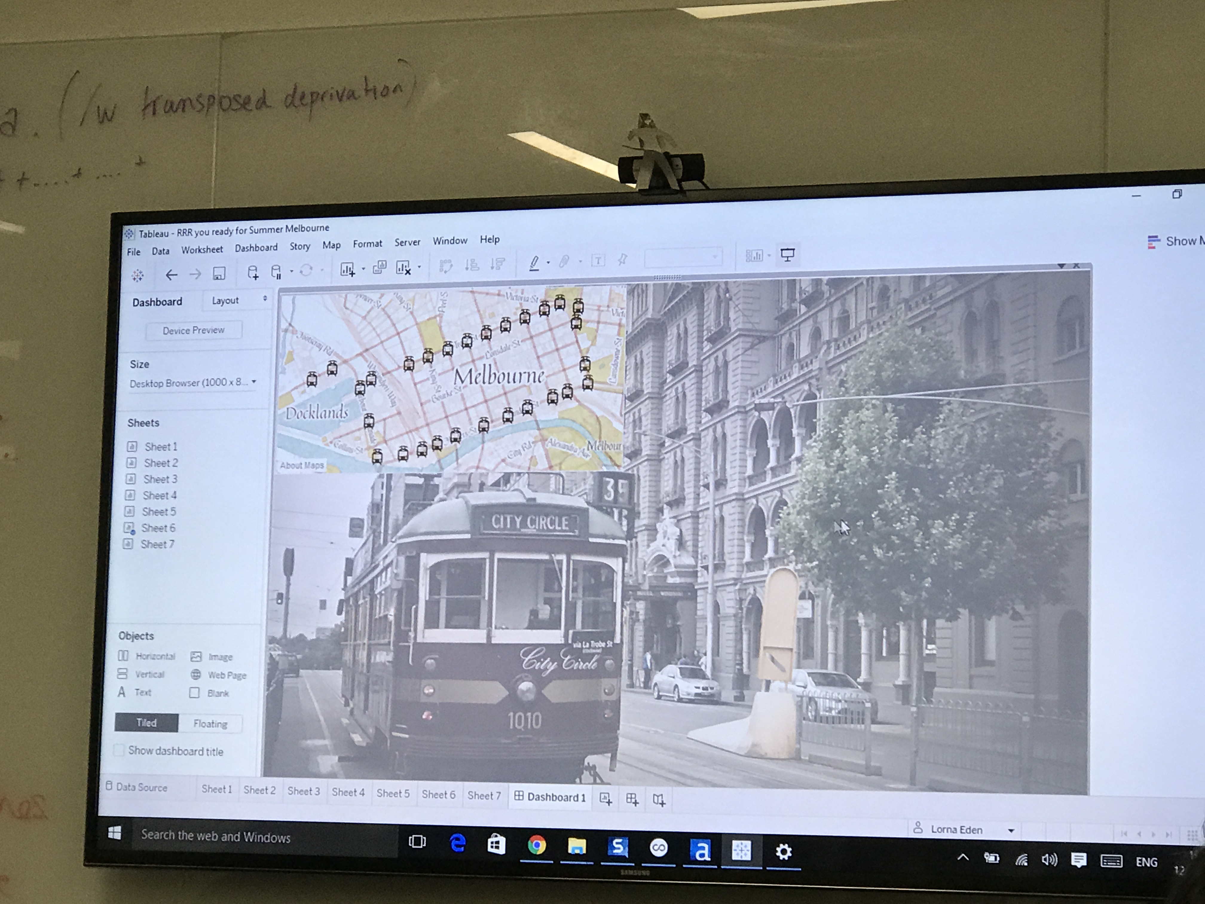
After searching Google Images for inspiration, we find this awesome picture of the City Circle Tram. To try and make it more palatable as a background, we used floating text boxes with shading so the map (and upcoming unit charts) don’t look too harsh against the detailed image.


Guest Appearance by Cynthia Andrews!

Data Rules Me stopped by to check out our viz session and gave us some great tips on making this mobile.

  • Never use floating on a mobile viz (thank goodness we had device designer)
  • Always fit width since folks are already used to scrolling

Looks pretty good IMO! We created a custom image for the top since we wanted to keep the image/banner, but everything else is just the sheets with our custom color background.


Final Thoughts

Overall, it was a really fun night! I didn’t expect to learn as much as I did, and its always great fun choosing design options, and thinking about where the story should go as a group!

Plus, its hard to beat this:


Until next time folks!


Makeover Monday – Washington Metro

Here’s my Makeover Monday contribution. For those that don’t follow the project, its where our community of data viz folks try to reinterpret and improve on an existing infographic/chart.


Here’s the original


Here’s my contribution: