David McCandeless is a titan in data visualisation – no doubt about it. And with The Science Museum’s immersive IMAX screen, we saw the vastness of a billion dollars, examined the medical veracity of “superfoods” and proved the most controversial question of all – what is the best dog breed? (All backed with data!)
With beautiful colours, composition and storytelling, McCandeless’ approach to data visualisation invites all audiences to engage with the world around us. Like a bakery window with glossy cakes, he draws users in with data, design and a story.
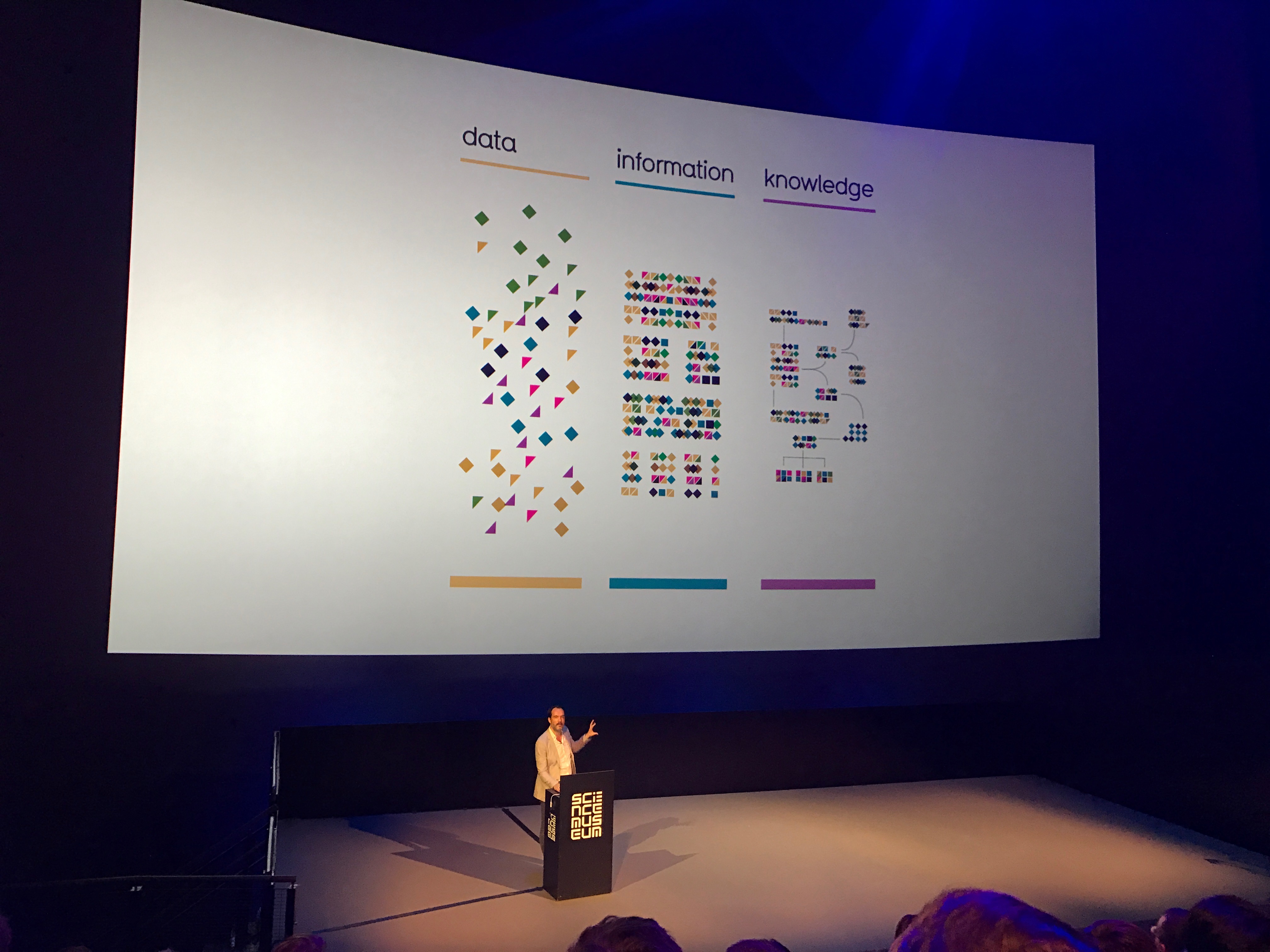
But how does this message fare in a room full of quants? He demonsrates data visualization’s power to engage with his final audience game, asking a series of questions of what is more popular on Google: Beer vs Wine, Cornflakes vs Toast, Youtube vs Sex (the answer may surprise you). 400 people immediately took to the 101 of data analysis: to think, take a guess, and to revise one’s answer. By demonstrating how data visualization can bring conversation, McCandless taught an audience of all disciplines how we can be inquisitive about our data- to move from information into knowledge.
Unsurprisingly, the topic of fake news was raised during the Q&A period – how can we spot fake news? As a journalist, ad man, and designer and developer, all these talents still suggest this 1 answer: its tough to spot and trusting your source is key. Data Visualisation is powerful – use it wisely.
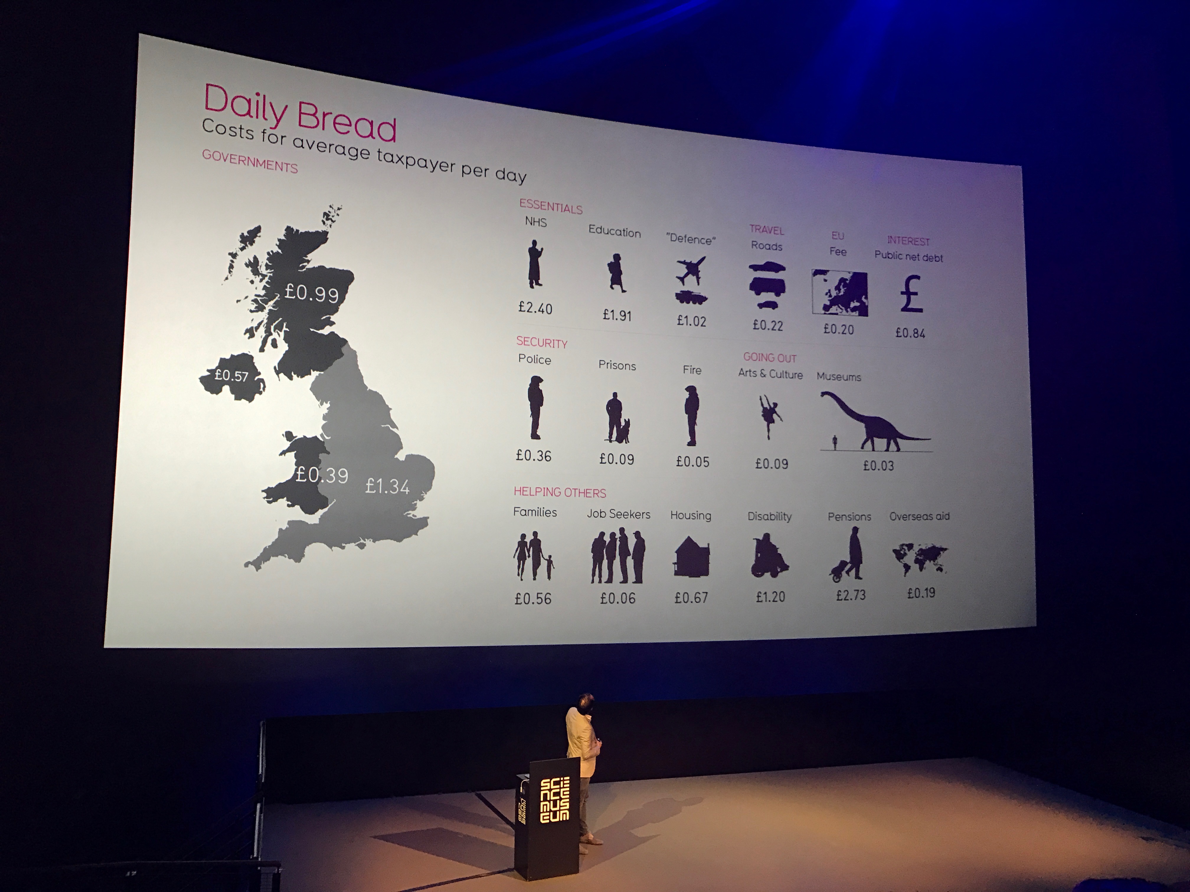
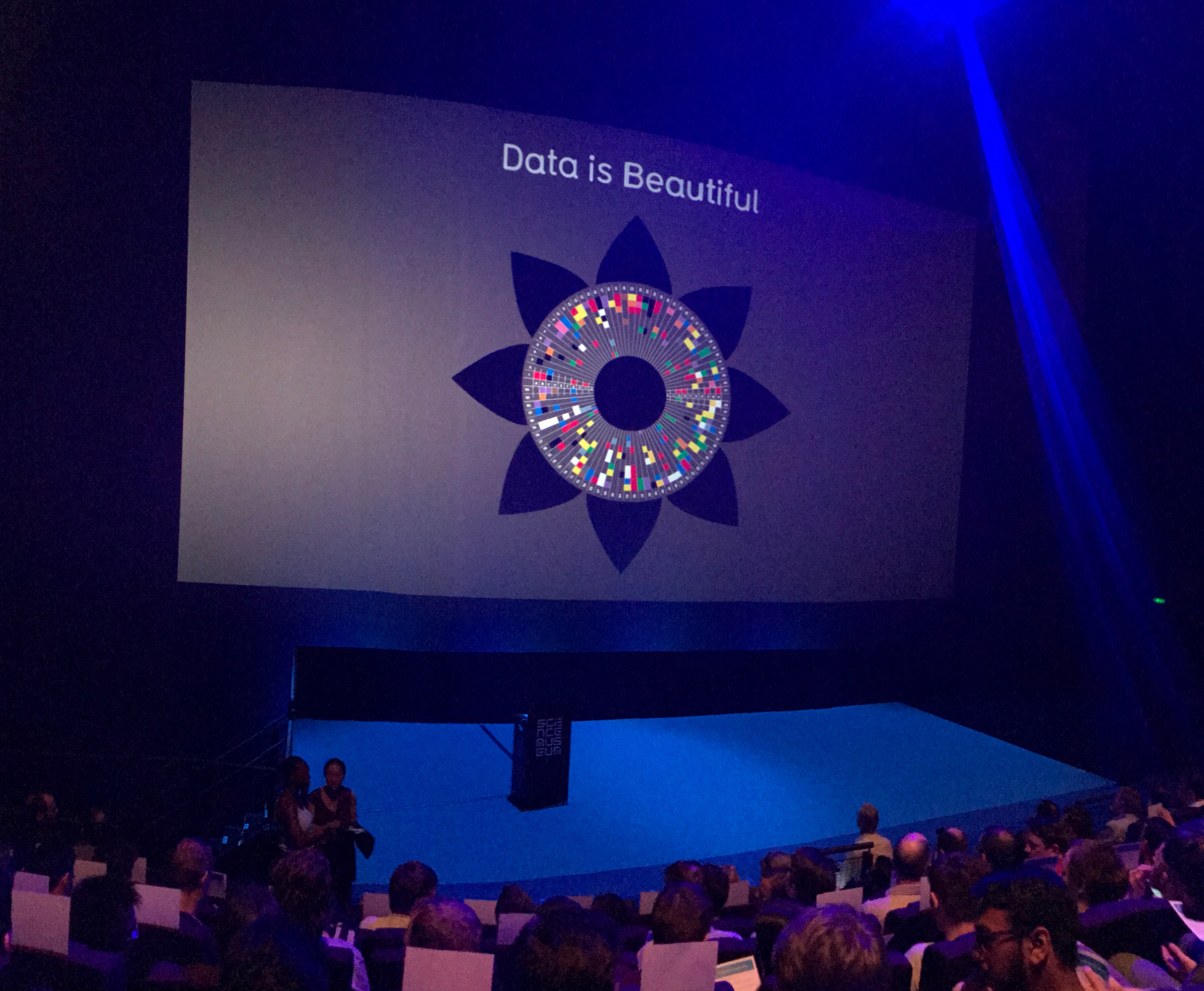
Here are some of my pictures from the event: