
How to Find Conditional Averages by Week

One interesting piece of analysis is to look at your KPIs normalized over time.

For instance, its important to know your sales in the last week, prior week, last 4 weeks.. but we wouldn’t be able to compare the results from the last 4 weeks to the last week.

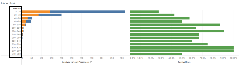
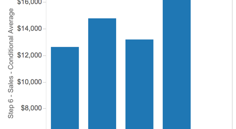
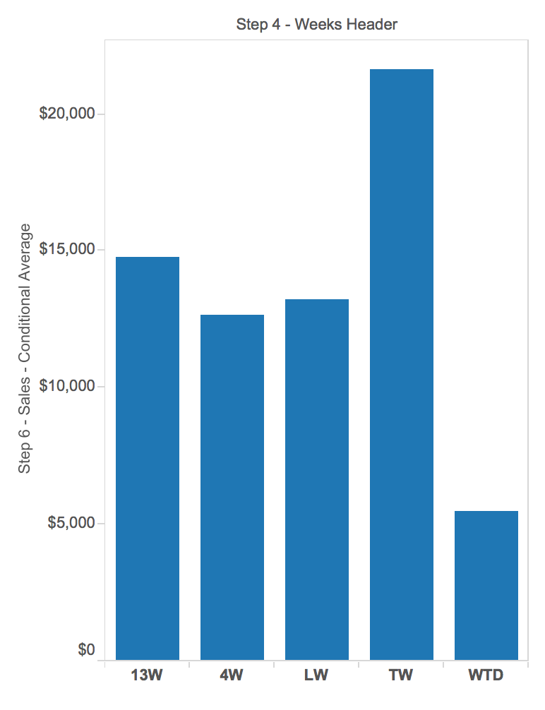
But we could if we compared results all averaged to the week level of detail. Below we see results in the last 4 weeks of Superstore. We see that Sales in “TW” (This Week) were not only great, but great even compared to average performance in the last month or last 3 months.


Here’s how I did this:


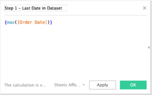
Step 1: Find the last date in the dataset


Step 2: Find the last full week in the dataset

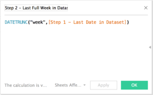
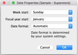
Also remember that the values you get from this calculation are driven by your configuration on which day is the start of the week. This gives me a start for Monday.


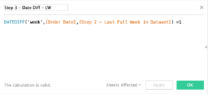
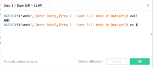
Step 3: Set up your various measure partitions by date.

Here I’m looking for dates that are 1 week in difference from my last date. Therefore, I would find the Last Week.

Here I’m looking for dates that are between 13 weeks in difference from my last date and greater than 1 week in difference. Therefore, I would find the Last 13 weeks.


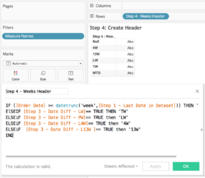
Step 4: Create headers for your values (coming up soon)

This allows me to bin my values.


Step 5: Create denominators for your averages

This calculation is where the conditional average comes into play. Since we know the headers represent a certain amount of time, we can hardcode the number of weeks the value will be divisible by.


Step 6: Create your conditional sales metric.

We’ve already done a lot of legwork prior to this to line up the correct dates in the headers – so the sales values will naturally fall into the boolean statements we’ve already created. Same for the denominator values.


Its a way of looking at the business I hadn’t yet seen before but great usage of adding numbers to context. Hope you’ll get to use it soon!


How to Update Multiple Filters with 1 Click

I came across a dashboard at the client site with a pretty nifty trick. Big thank you to Charlotte Horgan for this innovation 😀

Ever found it annoying when you have multiple filters active on many sheets in a dashboard?

You would make your selections in 1 filter… then wait for the dashboard to update, then the next filter would have to update.. and the whole process just takes a little too long especially if you have many marks on your vizzes.

Is there a solution? Yes – with action filters!

Step 1: Establish your Level of Detail to filter your vizzes 

Create a new sheet with all the filters you want applied to your dashboard to your sheet as well as having them on detail.

Notice that Tableau has started to draw many circles? There’s exactly 11 marks to reflect the unique combinations of Regions, Subcategory and Segment in the viz.

Step 2: Create the following IF statement

iif(first()=0,”Update Dashboard”,null)


Step 3: Place this calculation on rows and set ‘compute using’ to cell

As I mentioned, each mark represents each unique value of the dimensions in the view. Therefore to create a “one button” experience, we’ll have to figure out how to select all the marks at 1 time.

In this case, I’ve set the table calculation’s partition to “reset” to every new value in the view. This way, the calculation will always return a value of TRUE (which is this case is “Update Dashboard”). So I will always select all the marks at 1 time. We see this is working because we’re only returning 1 header in the view.


Step 4: Start building your viz and set up action filters

Here’s the layout of my dashboard. The filters are from the “Update Dashboard” sheet with no filters on the other visualizations. Make sure the filters are only applying to the “Update Dashboard” sheet.


In mine, I have 2 action filters but only the first one is necessary to make this work.


Step 5: Enjoy and test your viz!

Here’s my example workbook:

[iframely]https://public.tableau.com/views/HowtoUpdateMultipleFilterswith1Click/HowToUpdateMultipleFilterswith1Click?:embed=y&:display_count=yes[/iframely]

How to Start/Stop your Script in Python

Sometimes when we’re running a script, we want to be able to break down and review portions of our code. In Alteryx, we can easily do that with the cached results function in every tool or we can use the Browse tool.

In Python, we can use this little trick with the “raw_input()” function.

Say for instance we want to run 2 pieces of code

  1. Give me a list of odd numbers
  2. Give me a list of even numbers

But I want to be able to check over my work in the first section before running the 2nd. This is really useful if your data is EXTREMELY large and takes a long time to run. To avoid the pain of spending 20 minutes waiting for your script to finish running, only to find bugs early in the process, checking your results throughout (in conjunction with a filter!) will hopefully save you from lots of hassle.

Here’s the script:

# How to start and stop your code

# Step 1: Prints some odd numbers

for x in xrange(1, 20, 2):
print x

# Step 2: Pop up messsage that stops the script from running the next function until "enter"

raw_input("Press <enter> to continue")

# Step 3: Code continues on and prints some even numbers
for x in xrange(2, 20, 2):
print x

Here’s the video on how I did this:


How Do I Prepare for #data16?

So you’ve taken the plunge and are going to the Tableau Conference. Everyone talks about how amazing it is and how many people you’ll meet… so how do we make sure you’re going to have an awesome time in Austin?

I’ve already gone into the future and video recorded how I’ll be on the plane.

via GIPHY

I’m asking Jonathan Drummey, Paul Chapman and Carl Allchin on the Tableau Wannabe Podcast how I can make this happen.

A couple questions come to mind:

Who are the best speakers to watch? 
Lots of people have told me that this is one of the best ways to pick sessions. Who’s on your list?

What events are “can’t miss”? Which ones are “meh”?
We only have a couple days! Don’t want to be left out of a session that everyone is buzzing about!

All the Tableau sessions are recorded? Any value in going to them anyways?
Realistically, do you actually go back to watch them?

According to Paul Chapman, we should do test runs of our conference plans?
Overkill or necessary?

How organized do you need to be about this conference?
Based on the blogs I’m reading, it seems I should have almost every minute planned!

What are some recommended sessions for Tableau Developers? Server Specialists? Biz Folk?

What’s the best swag you’ve ever gotten at the Tableau conference?
Which reminds me that I gotta get moving on my Spotify vi

Got questions?

Let me know by Oct 27, 2015 9PM BST and I’ll get it into our podcast!

Emily

How to Label Bin Ranges in Tableau

Histograms are great for helping us understand distributions of data, but Tableau currently doesn’t allow for the ability to label the upper and lower bounds of bins ranges.

Much thanks to Rob Suddaby for asking this question and to Robin Kennedy for his great answer.

Feel free to download the workbook from Tableau Public

Step 1: Create a Calculation

Here I’ve built in a parameter so I can adjust the size of the bins dynamically. If you only need it be a certain size, simply replace the purple fields with your bin size.

str(INT([Fare]/[Bin Size])*[Bin Size]) + ‘ – ‘ + str(INT([Fare]/[Bin Size])*[Bin Size]+[Bin Size])

The calculation works in 2 parts:

1) Calculating the upper and lower bound of the range.

2) Converting these values to strings and adding formatting with the “-”

Step 2: Build your view!

Thanks for reading!