
When I worked in industry, everyday I reported sales performance at the day level and compare its results against the same weekday the previous year.
“If we had a bad YoY comparison, did we have a big promotion the same day last year? Or if not, which categories did better or worse?”
To add to the complexity, the business had a regular promotional week where new pricing would update every Friday. So comparing Jan 6, 2017 (a Friday with new prices and promotional tactics) against Jan 6, 2016 (a Wednesday) was not helpful!
Its an excellent way to look at the business tactically, and get some actionable insights quickly. And luckily it’s really easy to do in Tableau!
Step 1: Find the same weekday last year

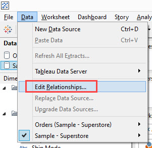
Step 2: Add the same datasource again
Here, I’ve added Superstore again through the other menu since it was giving me grief through the “Saved data sources” pane. This way, I can just simply navigate to the dataset sitting under “My Tableau Repository”

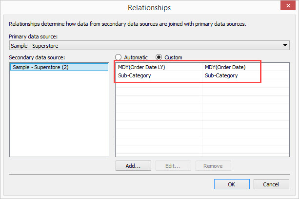
Step 3: Configure the blend through the Edit Relationships
Here we specify that we want the “Day/Month/Year” of Order Date and Order Date in the Previous Year to match, as well as the product subcategory. This is how we’ll be able to see which subcategories had new or declines in sales between the years.
Step 4: Validate your data post Edit Relationships
Put [Order Date] and [Order Date LY] from the same data source (the first one we pulled in) on rows and [Sales] from the same datasource on Text.
Then put [Sales] from your secondary datasource on the marks pane to create the following table.
In the view below, I’ve already renamed it to be [Sales LY] in the secondary datasource. But remember that its only because I’ve got my edit relationships set up and I’m using this as a secondary datasource that it will render sales this way. Otherwise, it will not retrieve sales from last year,
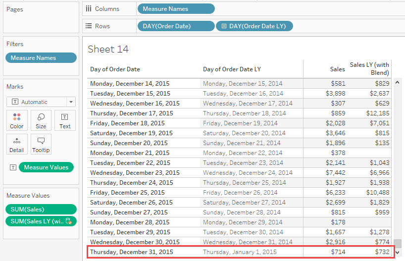
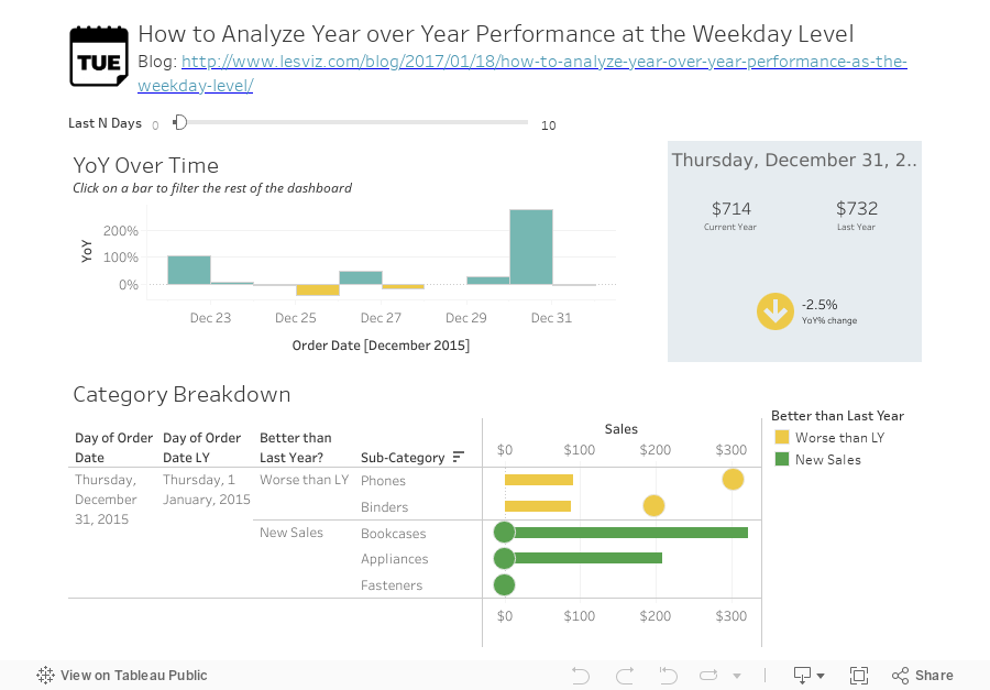
Want to check to see if its pulling in the right value? Just scroll up [Order Date] and check if its referencing the right sales amount. Here – the $732 in sales match!

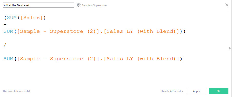
Step 5: Create your Year Over Year Calculation
Then see what it looks like against time..
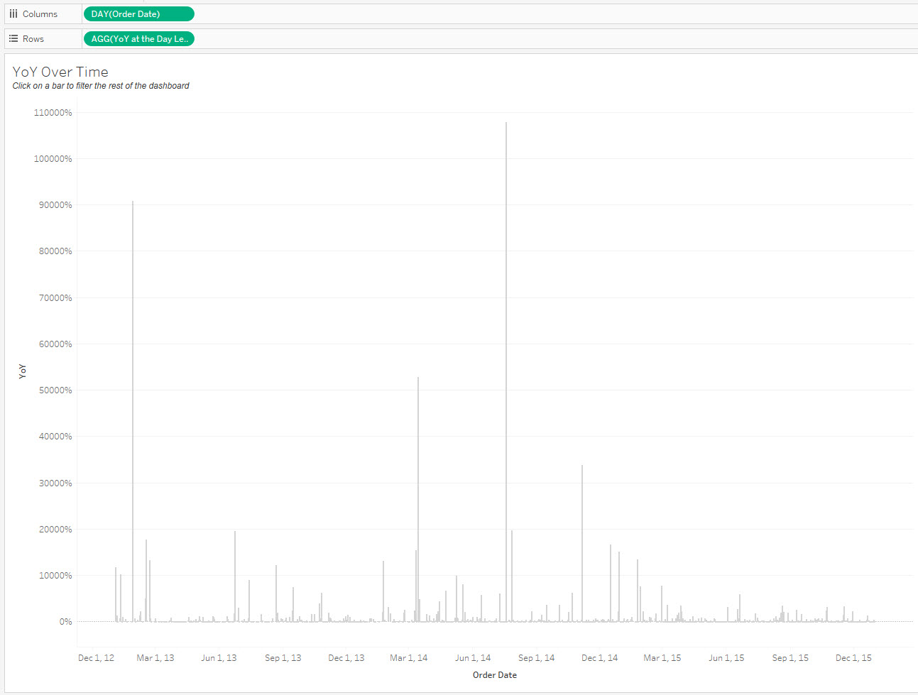
I find this view (while computationally correct) too messy and variable to garner any insight.
I find it much more useful when I filter the view to the last 10 days. Even better when I conditionally color it against if its done better or worse than last year!
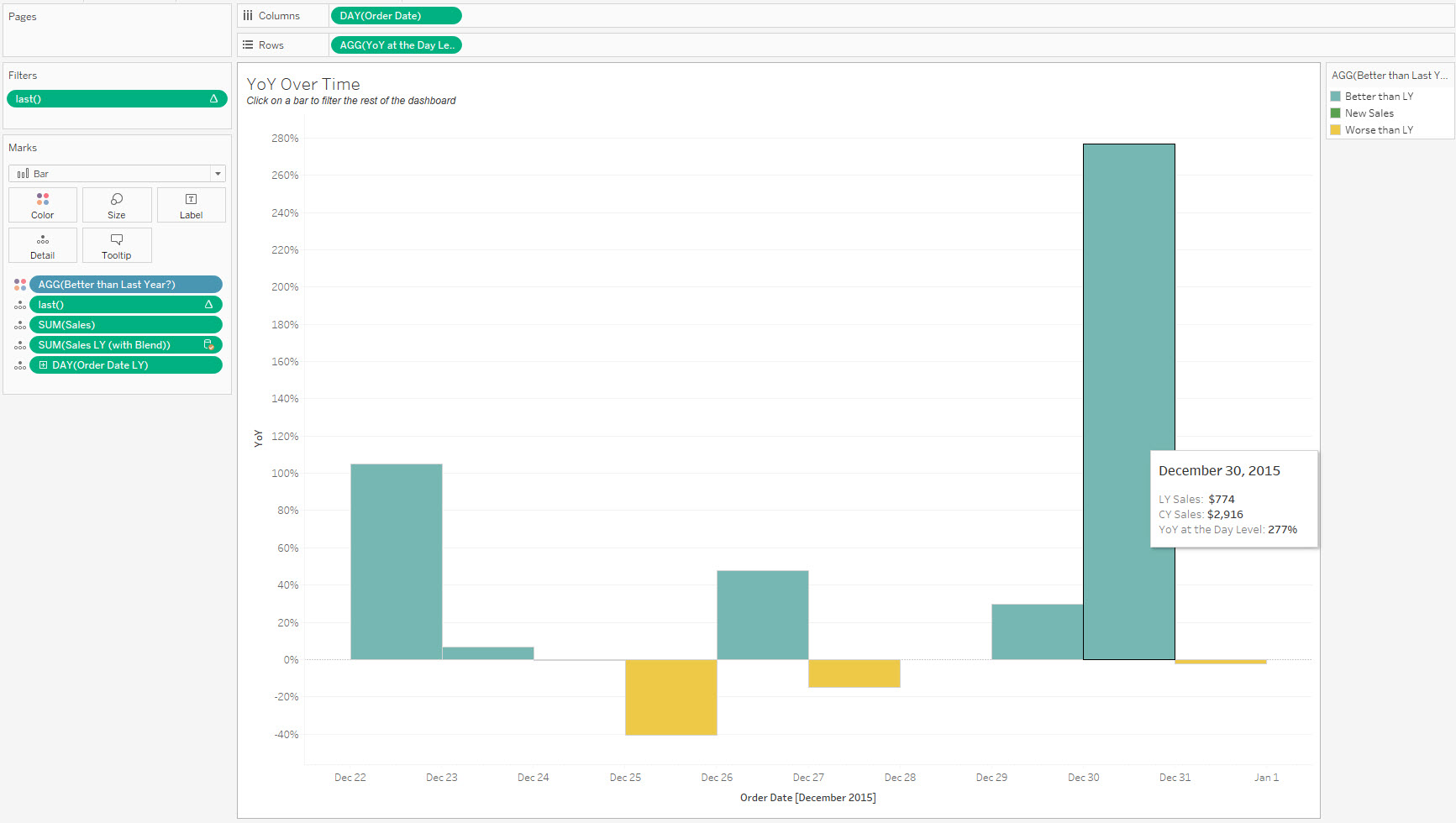
Step 6: Build a dual axis bar chart with [Sales] on 1 axis and [Sales LY] on the other.
Final Thoughts
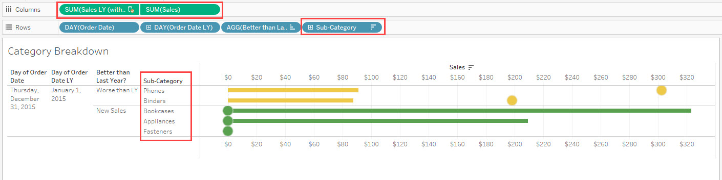
In the last view, I’ve already got it filtering by a particular day, but I can easily attribute which categories I made gains in, and which ones I wasn’t able to produce better results compared to last year. Maybe the promotional tactic wasn’t as good, maybe there were extenuating factors. But its great to know isn’t it?
Hope this will be helpful for you!