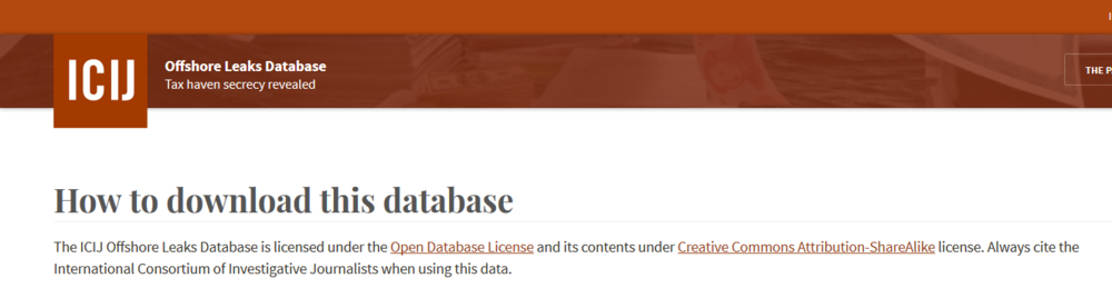
For this month’s Viz Club, we analyzed the Panama Papers from the ICIJ Database.

Kudos to the Viz Club members:
- Sophie Sparks for choosing a winning dataset
- David Pires for making the Pub reso (we managed to get by without a pocket projector, but if you come with one, I’ll buy you a drink AND let you choose the music.)
- John MacDonald for sourcing the dataset despite being away for work
I would say the night was split into 3 parts:
- Trying to download journalism’s largest data hack in a pub. It was exactly like that scene in The Big Short except there was no Brad Pitt and no internet. While no where near as painful as our first Viz Club, we got there in the end.
<fast forward the the second hour>
- Trying out the dataset on Tableau 10.2 beta with excellent driving by Waseem. While our immediate question was whether we could put charts in tooltips (answer: not yet) we got a chance to play around with the beautiful new UI and potentially find a bug with the mapping function.
 Viz Stretches
We also found some interesting insights about the addresses in this ICIJ datasource. Mind you, they are pretty upfront that the extracts are not the entire database and require professional judgement before determining if there was wrongful action.
Especially after vizzing the “addresses” table, it paints a completely different picture of the news with a significant number of companies from Asia including China, Taiwan and Hong Kong who have trusts. In fact, the focus of The Panama Papers has been around the trust we have/privilege we put on our politicians. I think this is an excellent example of having a goal before diving into data because, especially at an aggregate level, the data can tell a very different story.
 Disclaimer as you enter the site
The last part of the night kicked off once Chris found that the entities table outlined where companies had set up their trusts. Once we figured out it was a simple delimit to get the entity’s country and its respective trust’s registered location, we hit our second wind.
Yes- we immediately wanted to build a map with curvy lines!
 Exact reaction right here.
Sophie was all over this. She pulled up this gem from Alan Eldridge where we wouldn’t even have to do the data prep after we delimited because in Tableau 9.0, we could pivot the data right in Tableau!
 Sophie in the zone
Alas no lines! No map! No VIZ!? After looking at the blog post in more depth at home, it turns out the solution was a tad more complicated than we expected (and that we couldn’t use the generated lat/lons in calcs).
 :'(
:'(
If you have any reservations about attending Viz Club, note that we have a reasonable 9.30 hard stop since it is a work night. We viz party like sensible folk.
<fast forward to today>
Of course, we can’t come away from Viz Club with nothing to show! Here’s the entity table in the Panama Papers visualized from the originating company’s country to its trust in a different country. Data preparation was done in Alteryx and I ended up using Chris DeMartini’s excellent blog post on Great Arcs in Tableau.
Click on the image to go into the desktop version of this viz. For this version, please set your resolution to 1920×1080 so the Title doesn’s look off. Not good UI practice I know, but look at how great that title looks overlaying the map!

And the curvy lines? Here you go!
Click on the image to go into the desktop version of this viz.

Overall, it was a really fun night of catching up, learning about Tableau’s newest features and getting hands on with one of the biggest stories of the year. Can’t wait to see what the next one will bring!

 Source: https://www.tableau.com/sites/default/files/media/whitepaper_tableau_server9.0scalability_eng_2.pdf


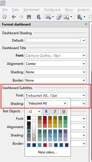


 Right-click sheet and format the WHOLE worksheet
 Right click on the bolded header and select Clear.