
How to Find the Number of Active Projects at Any Given Point in Time

This analytics problem is a rite of passage – we all eventually get asked it. And it usually goes to a tune like this:

“I have a list of projects with start and end dates. I want to know at any given time, how many projects are active.”

(Btw the TL;DR for this is actually this great video by my TIL colleague Andre)

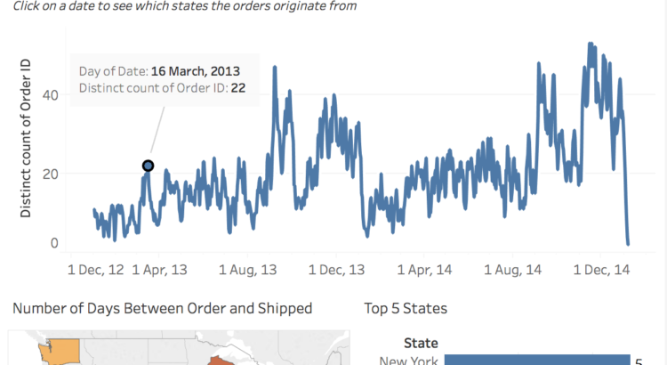
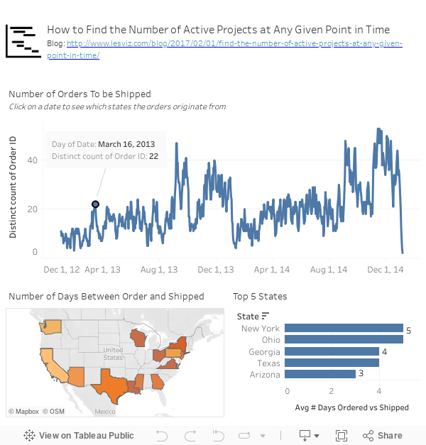
In this case, we looking for how many orders are being prepared for shipment at any given date?

Here’s my viz.

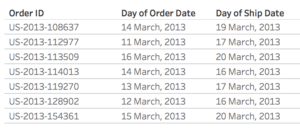
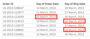
Using Superstore, the data you’re given looks something like this.

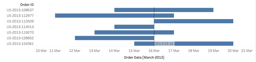
And visually represented, we know that these projects all overlap on March 16 2016.

But how can we express this as a line chart? i.e. not at a given point in time, but how many over time?

For such a simple question, it actually has a rather complex (but easy to implement!) solution. It requires a product join.

The difficulty with this easy to ask question is that …how can Tableau plot data for a datapoint that effectively doesn’t exist? That is, when we look at the data, March 16 only occurs 3 times.

So as smart as Tableau is, it does not know that all the orders in the list are in preparation mode, just like the other 3. (Well Tableau CAN know, but lets put densification aside for another day).

Step 1: Prepare your Data

Given this train of thought, that means we need to give each entry (order ID/employee/project/whatever your flavor of granularity) every date we want to compare against.

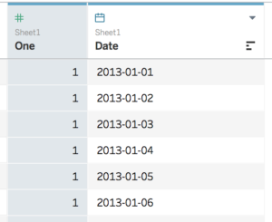
And since we want to be able to compare against any date, we are going to multiply each entry 365 times for 365 dates.  This will pad out the underlying dates and give the data structure we need to make this work!

That means you’ll need a dataset with dates you want to see in 1 column and a dummy variable in another. I’ve very creatively called mine “One”.

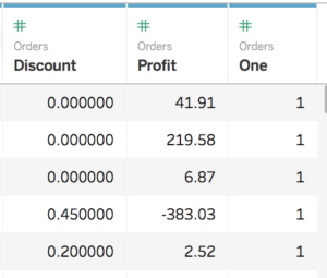
Then you’ll have to add the dummy variable to your original dataset. In this case, I added a “1” running a straight column down the Superstore data.


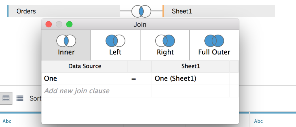
Set it as an inner join in Tableau

Almost there!

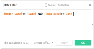
Step 2: Create Your Date Filter

.. then put this filter on columns.

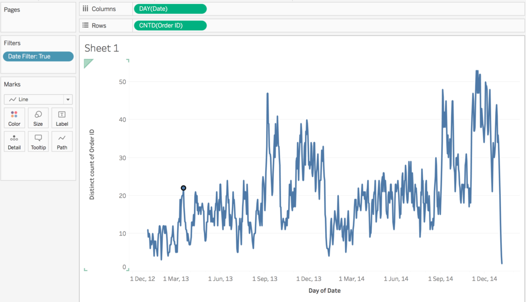
Step 3: Start to create your view!

Put date from your dummy dataset on columns and add the count distinct of your chosen dimension on rows.

In mine, I get something like this.


Other resources I’ve used to get to this method include this great video by my colleague Andre and of course, the great Bethany Lyon’s talk on Cross Database Joins at TC16.


Happy Vizzing!~


Thatcher Thatcher Milk Snatcher: Make your Data Stories More Engaging with this Amazing Tableau Tip!

Just want to say upfront that VizClub March Edition was a huge improvement on the last session.

  • #ThrowbackThursday was on (that was me)
  • The dataset was required less than 3.5 hours of cleanup (thank you JMac)
  • Beer was on tap (which I got in on since I realized Coffee and Pizza just didn’t make sense)

Big shout out to Sophie who was kind enough to provide the pizzas despite being sick.

Sophie also made another huge contribution to our viz session – being the first to introduce unicode characters as a navigation element to create a fluid user experience. I first wrote about unicode characters in vizzes with the Data School so I’m always finding new uses for them.  It’s so easy to do, I’ll be stealing it for my own future vizzes!

Here’s a gif of the viz moving through the storypoints with unicode characters.

Read below on how to do this for your own vizzes!

Step 1: Copy and Paste a Large Circle Unicode character  (like this one!) into your storypoints template.

Step 2: Here’s the magic. Set the font so the unicode character will stand out.

Here I’ve set it to size 28. Go into Story->Format and set the shading in Navigator to “No Fill”. Then squish the titles on the top and bottom so they line up perfectly line a series of dots…just like navigating through a slick app.

Voila! Next level design in 1 minute right?

Getting back to Viz Club, in terms of exploring the dataset, we found a couple of interesting insights.

  • Overall consumption of sugar as a product in itself has gone down over the years (probably displaced by other sugary products)
  • Vegetable consumption has also gone down 🙁

Then somehow we got to the introduction of our story when we were looking at the consumption of milk in the early 80s. Wondering why there was a spike in ’82, we realized that Margaret Thatcher’s tax cuts in education boomed the consumer market for milk. For me and Andy, who are from North America, this is something we never knew about UK politics!

Couldn’t believe it actually shows up in the google search

Another interesting insight was looking at how potato consumption has changed in the UK.

@davidmpires Took this picture of the area charts of potatoes. I think the dip was actually due to a bad crop year, rather than a sudden decreased appetite.  @davidmpires Took this picture of the area charts of potatoes. I think the dip was actually due to a bad crop year, rather than a sudden decreased appetite.

You might be curious to wonder why the middle of that horrendous area chart there is a dip. Luckily we were too, and found out there was a heatwave in 1976 and a potato shortage in the US.

More importantly, what did people eat if not potatoes? Turns out, they SWITCHED to a new market of potatoes – notably instant potatoes.

By the way, if you click on the this image, it will take you to this viz where the ad will start playing. This was intentional as we've already established it was #throwbackthursday and automatic music on websites was THE hip thing to do in the 2000's #RIPmyspace. By the way, if you click on the this image, it will take you to this viz where the ad will start playing. This was intentional as we’ve already established it was #throwbackthursday and automatic music on websites was THE hip thing to do in the 2000’s #RIPmyspace.

Apparently the people at Cadbury’s were smart cookies and did this very clever(?) ad for Smash Mash Potatoes. I’m told everyone and their grandmother has seen this but here it is if you haven’t. Skyrocketed the sales of instant potatoes I’m sure.

We capped off the night with another beer as I sped formatted the viz. Overall, it was a fantastic night of pizza, beer and learning about politics and robot aliens! Can’t wait for the next one 😀


How to Scale Tableau User Filters in 5 Steps

I’ve been working on a sales dashboards where I am visualizing a set of transactional data. One of the requirements was for Tableau Server to recognize the user and their territory upon login. Easy peasy with Tableau User Filters right?

I want to show you how you can do this easily if you have the following complications:

  • Multiple sales reps to 1 region– joining these two datasets will multiply your records (and over-report sales dramatically!).
  • Have a large number of users (I have over 100 reps) and no time to update it manually and constantly as the team changes.
  • Lots of sheets in your workbook and did not want to spend the time adding the user filter set to every sheet.
  • You also dread Tableau’s inevitable “*” error on a blends for your joining table.

Big thanks to the Great Chris Love for this tip!

Step 1: Find Your List of Users and Pivot your Data

You’ll need 2 pieces of data – assigned Tableau Server Usernames, and their respective regions. I’ve mocked up a dummy data set to help illustrate with our favorite retail store – Superstore. Usually the USERNAME() function will be a reflection of your organization’s system username if your Tableau Server is using Active Directory to authenticate/login your users.

As you can see, we have 4 sales regions at Superstore, and 2 sales reps look after each region.

Quick view of my raw dataset

Tableau Usernames for Tableau User Filters

We need to pivot the data so it ends up as a lookup table, but concatenating usersnames to sit in 1 cell. I did this bit in Alteryx.

Alteryx Workflow for Tableau User Filters -Here’s what my workflow looked like with annotations. Alteryx Workflow for Tableau User Filters -Here’s what my workflow looked like with annotations.

BONUS TIP! Did you know you could annotate your tools instead of using the comments box? Much easier when you’re moving around tools in your workflow.

Step 2: Join your lookup table against your transactional data and output your data into Tableau!

Step 3: Connect your output (.tde/.csv) into Tableau and login to your Tableau Server

Connect your data source and sign into Tableau Server. Connect your data source and sign into Tableau Server.

Step 4: Create the following calculation:

Since our usernames are concatenated to exist in 1 cell for every territory, this creates the association between 1 territory and many usernames upon a user’s sign-on.

Step 5: Create a data source filter using the calculation above and Select “True”.
The calculation will look up the username and will filter to the territory specified in your lookup table (now joined against the transaction data)

That was the last step!

You can use the navigation at the bottom to change users views just as you would with a set recommended by Tableau. Hopefully you’ll use this clever method of data pivoting to bring a better UI experience to your Tableau Server users.

If you’d like to download this workbook to see the other calculations, visualisations I have used, you can access the workbook here. Note that the filter will not work with your Tableau Server so I have removed it to avoid confusion.