This is my second Iron Viz entry but I wanted to share some of my thoughts.
Design
Beige background: I saw this on a couple vizzes in the first round and its stuck with me – pleasantly bland like white but more interesting.
Tile numbers from VizCandy: This has to be one of the original Tableau mobile dashboards. Kelly Martin built an amazing mobile experience…without mobile designer.. like a year ago. #iamnotworthy But now when I think mobile, I think of the tiles — hence why they are in my Iron Viz.
[iframely]https://public.tableau.com/views/MobileExampleStory/MobileStory?:embed=y&:loadOrderID=1&:display_count=yes[/iframely]
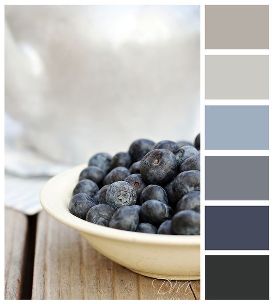
Another design tactic I love about Kelly Martin’s work is how she conveys what I call “color texture” in a viz. The example I always think of is this one:
[iframely]https://public.tableau.com/views/TEST3/Dashboard1?:embed=y&&:loadOrderID=2&:display_count=yes[/iframely]
To me, it brings a complexity/feel that a chart can nicely sit within. I found this photo on a pinterest board. Can you tell the inspiration?

I also tried out a new font – Rockwell. Use with caution as it naturally comes out bold and I still used my favorite Gill Sans MT for the body text and annotations. Everyone always comes out clean and neat with that font!
Personally, i’m a bit disappointed I didn’t get to use more complex visualizations. But I love bar charts so what you gonna do. ¯_(ツ)_/¯. Also disappointed I didn’t produce a FR version given I had both pieces of data.
User Experience on Mobile
Think about how much testing you do on you regular dashboards – then double or triple that for mobile. This medium is probably one of the trickiest to design for – small space and everyone’s operating on different dimensions, not to mention you’ll have to allot margin space for the Tableau Public embed.
For me, I’m on a iPhone 6S but I had to switch the dashboard to the iPhone 5 width to comfortably fit everything. Even then I wouldn’t be surprised if there are formatting boo-boos.
Story Development
If each viz was a sentence in a story, then its pretty hard to write long descriptive sentences in in mobile vizzes. Not only is there no space, but also despite what we are able to fit in on the page, too much distracts from the message… so we kind of gloss over and the experience is forgettable. Despite all the amazing sites, I felt I could only annotate 3 on the map else it too overwhelming for comprehension. Sad but true.
Also, don’t bother designing with tooltips on mobile. I find them pretty unstable. I still used them in my viz because I wasn’t sure if a show/hide floating sheet with the site descriptions would be any better of an experience compared to the hover. But I just love reading the history that it would be a waste to leave them off.
Hopefully someone is reading them!